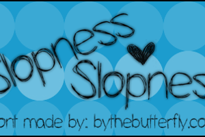
Kenzie Font
by ByTheButterfly
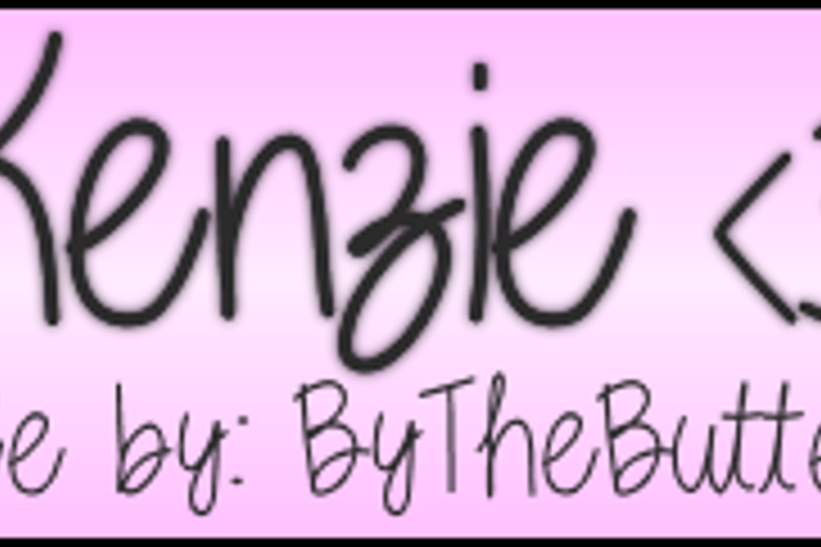
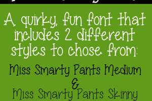
Medium Style

Designed by
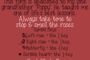
About Kenzie Font
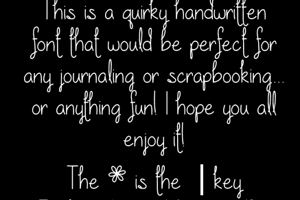
Thank you for interest in my font :) My fonts are free for personal use only. If you are interested
in commercial use, please contact me @ [email protected] You may redistribute my fonts on your site as
long as you give credit to http://bythebutterfly.com as the original creator.
Donations
Commercial licenses
Related Styles
Comments

@Spacini Your opinion is always welcomed, and it means so much to me that you like this. Amanda Rae was just used on a music video, and I saw some things I need to change, and I also planned on changing the F. Thank you SO MUCH!! You know your comments mean a lot to me. <3 Ness
@Spacini Just updated the F. Let me know what you think 😄

Great work, like usual 😄
@Nate547 Aww, thank you!!

Yes! That new F works very well with the set. (The capital I is still gasping for breath.)
@Spacini The I looks fine, it's just ever so slightly too far over to the left.
@Nate547 Ya, I am updating it now 😄
The I has been moved ever so slightly to the right 😛
@Spacini I moved the I as much as I could to match set. Hope its at least a little better lol
Yes, yes, yes!

OMG How did I miss this one ??? Thank you x
@hevbee LOL!!!! TY!!


This is a great improvement over your Amanda Rae set! The upper and lower case letters are very compatible with each other, even complimentary in most respects. I would challenge you to consider redesigning the upper case F; out of alphabetical context, I think it's difficult to recognize. The only other letter I see a problem with--and this is very minor--is the upper case I. It needs to breathe! Keep up your great designs.