SonOfTime Font
by Pia Frauss
Regular Style


Designed by
About SonOfTime Font
This font is based on the handwriting of Giovanni Borgia/Joan Borja, duke of Gandia, who was the son of a pope and the grandfather of a saint, member of a much-decried family, and founder of a most pious one. Having been sent to Spain, to marry, in 1493, the widow of his deceased brother Pedro Luis -- Maria Enriquez, a cousin of king Ferdinand of Aragon --, and take possession of the Spanish dukedom said brother had left him, he corresponded a lot with his father back in Rome. It seems his father had much to complain about. Not only did Giovanni spend tons of cash to manage, enlarge, and aggrandize his Spanish possessions, but there were also reports that he had not consumed his marriage, didn't share his wife's bed, and was wont to roam the streets at night, in search of questionable entertainments. On 4th December 1493, Giovanni wrote a letter to justify himself in the matter, calling all such reports slander, protesting that he was in love with his wife, and had spent every night in the nuptial bed, except on one occasion, when it had been prevented by a social engagement of the most innocent nature.
Those reports seem to at least partially have been slander. When he was ordered back to Rome, in 1496, Giovanni had already had a son by Maria Enriquez, and she was expecting a second child. However, the one thing he can surely be reproached with, is that he got himself assassinated, in a highly stupid manner ... by doing what he had sworn in his letter that he didn't do, i.e. roam the streets at night, "to go amuse himself". At Rome, no less. Which was a hotbed of Borgia enemies. After he had been missing for some days, his corpse was fished out of the Tiber river, mid-June of 1497, leaving no doubt that he had already been dead when he entered the water. He had been twenty-one at best. Nobody was ever brought to justice for the deed. His father was devastated, his wife never remarried, and entered a convent when their son came of age, and his son carried on in the Spanish dukedom of Gandia, maybe well traumatized by what he had been told about that murder; for nothing short of an angry mob attacking, could induce him to leave his home. Nevertheless, he ended up with about twenty children there, from two subsequent marriages ... among them Saint Francisco Borja.
An image of the first page of Giovanni's autograph letter is displayed on the website of the Institut Internacional d'Estudis Borgians, and, considering that Giovanni was seventeen when he wrote it, it struck me as remarkable. His handwriting is never flashy, very matter-of-fact, and rather condensed, but it shows an amazing sense of harmony and proportion. This is certainly not a spoiled brat's hand; in fact, it looks quite mature, and tells at least of a first rate education. Then again, it has been said that Giovanni's mother came from a family of artists -- perhaps his talent had been passed down with the genes.
Well, after falling in love with Giovanni's ls, at first sight, I made the font. Since the image is rather low resolution, my font is no exact copy of Giovanni's writing, and altogether I decided to keep it as much on the 'modern' side as I could. For example, I didn't go along with the room-taking bows at the the end of his hs, and chose a rarely used y that doesn't look too exotic for 21st century eyes. I thought it didn't matter much, since, anyhow, I had to invent a lot of other stuff. Indeed, my only complaint with Giovanni Borgia is that he was so shy of capitals. Apart from the initial A, I could only find a V, an S, and something that might do as an E (though it isn't one). All the other capitals are made up, as well as the k.
I've included my own rendition of the Borgia arms on the micro sign, designed according to what I learnt on the Net, and remembering an image on the cover of a Borgia book by Susanne Schüller-Piroli, where the escutcheon takes the form of a heart. Based on a mistaken etymology, the bull has been the heraldic sign of the Borgia family for centuries. And -- BTW -- let's suppose that it wasn't just because of this that Saint Francisco Borja took a decided dislike for the Spanish custom of bull-fighting (which was rather unusual in someone born at the beginning of the 16th century, when torturing animals was a popular entertainment all over Europe -- you may even find references in Shakespeare). Anyhow, in his latter years, Francisco Borja persuaded the then pope to send a Papal Bull (if this is a pun, history made it) to the Spanish King, forbidding bull-fights, as an entertainment "more fit for demons, than humans", and threatening heavy penalties for persisting. This Papal Bull was duly read, meekly accepted, and diligently distributed to the local authorities in order to be enforced by them.
The font was called SonOfTime as a reference to Josephine Tey's novel The Daughter of Time -- because, while collecting background information on my font, I got somewhat upset by all the scandalmongering gossip that is still dished out as historical fact, concerning the Borgia family. The Net is full of it, in every sense of the word. There are only two notable exceptions, first the website of the Institut Internacional d'Estudis Borgians -- as was to be expected --, and secondly Rafael Sabatini's book on The Life of Cesare Borgia, which will be hundred years old, come 2012. Sadly, it seems to have been no more efficient than the Papal Bull forbidding bull-fights. Of course, it's far less entertaining than Josephine Tey's witty approach to her subject, but at least Sabatini went for the sources, and did his best to show their credibility (or lack thereof). Well, perhaps this was to be expected, too. Who would care for boring truths, when delicious scandal is to be had instead?
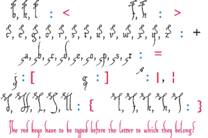
On the number sign of the SonOfTime font, you'll find the usual long s. The other special characters are
an alternate y on the 'bar' and 'broken bar' sign.
an alternate d on the left bracket
an alternate z, sitting on the line, on the right bracket
an alternate k on the left curly bracket, This is an important alternative, since the regular k is at war with the regular y, even when there is a space or another character between them
an alternate r on the right curly bracket. It's the one that is most frequently used in the letter, but somehow it didn't cooperate well with the other characters of the font.
an alternate I on the ASCII circumflex (don't forget to press the space bar)
a double long s on the long s sign
Two frequently used abbreviation signs, meaning 'que' and 'per', on the fi and fl signs. In case those aren't reachable on your computer, please try the masculine and feminine ordinal indicators, or the 'less-than or equal to' and the 'greater than or equal to' signs.