Tycho'sElegy Font
by Pia Frauss
Regular Style


Designed by
About Tycho'sElegy Font
The events that drove Tycho Brahe out of Hven, and out of Denmark, in 1597, seem to be a rather sordid affair. Most sources blame Tycho himself for it -- he had developped primadonna attitudes, he had been mean to his subjects at Hven, and so on. However, there can be no doubt that king Christian IV was the person responsible. All the alleged wrongs that were laid at Tycho's door, had existed for quite some time. Yet Christian IV's father seems to never have cared about them. It was Christian IV who jumped at every pretext that allowed him to get rid of Tycho -- even reaching as low as having Tycho's morganatic wife called, Tycho's mistress, which is the more upsetting, since Christian, some years later, took a morganatic wife himself! Certainly, Christian never gave any consideration to peasants' and fishermen's complaints, except when it fit his purpose (otherwise, he might have been obliged to boot a great deal of his nobles out of his kingdom). In Tycho's case, it did. Christian IV regarded Tycho as a welcome occasion to economize, and his device seems to have been, from the start, 'war, not science'.
Well, after king Christian had cancelled, first Tycho's Norwegian fief, and then his pension, Tycho retired from Hven, first to Copenhagen, then to Rostock, and then to the castle of Wandsbeck, near Hambourg. At last, he accepted an offer from the German emperor, Rudolf II, and went to settle at Prague, where Rudolf resided (and, guess what? Rudolf, though a rather disturbed person himself, never felt offended by Tycho's alleged lack of submission, and primadonna ways, either). In the interim, at Wandsbeck, after leaving the service of a king who had plenty of money, but wouldn't give him any, and before entering the service of an emperor who would have given him plenty of money, but hadn't any, Tycho wrote his famous parting poem, AD DANIAM ELEGIA -- an eloquent diatribe wherein he complains darkly about ingratitude, intrigues, envy, malice, and ignorance. He, too, didn't dare to blame the king. It was that odious court camarilla that was out to undo him...
An autograph version of Tycho's Elegy, three and a half pages long, dated "1597 20 die Octobris", is on show among the digital exhibits of the Royal Library of Denmark (= Det Kongelige Bibliotek). This, now, is really Tycho's handwriting. More: if it's his handwriting, it is his calligraphy. It's a studied humanistic cursive, containing no traces of any local bastard style, the middlezone looking rather compressed, and angular, whereas many of Tycho's capitals are daring, swashy, and very roomtaking. When I was designing my font, based on Tycho's manuscript, his capitals were frequently off-limits -- e.g., there is no way to reproduce an I that cuts down through the next three lines, in a font! Luckily, Tycho is nowhere shy of capitals; for many of them, it is just pick and choose -- but of course, the poem being in Latin, I had to invent a K, Y, Z, X, and U. Since the name of Wandsbeck is mentioned in the text, Tycho even provided a W, though it shows that, with regard to this character, he may have been lacking experience. BTW, considering at what moment in his life Tycho wrote his elegy, it's fascinating to observe, how so many of his initals are giving the impression that they are carrying a huge, heavy burden around.
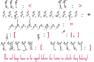
There is no number sign in this font. In its place, you'll find a long s. Other extras in this font are:
an alternate g on the 'less than' sign
an alternate y on the 'greater than' sign (that should be used with the regular g)
a swashed t on the right bracket
an alternate d, turned left, on the left bracket
an ending e on the right curly bracket
an ending n on the left curly bracket (can also be used as an u)
a swashed k on the bar and broken bar sign
a swash on the ASCII tilde. It has to be typed like an accent, before the letter to which it belongs, and looks nice with b, f, h, both ks, and l, especially before the second of a double l. Of course, Tycho would not use that. I made it up, according to the swashed t, which was really penned by Tycho.
a double long s on the long s sign.
The ASCII tilde has been relocated to the 'almost equal to' sign.
The image on the micro sign is my rendition of the Brahe coat of arms, and I cheated with the font name: the y at the end of 'Elegy' is the alternate one, since the regular g and y don't look well together.