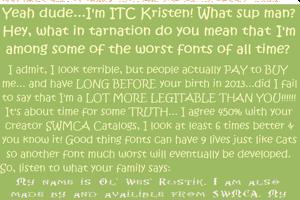
Ol' Wes' Rustik Font
by SWMCA Brands & Holding LLC.
2 font family styles
Medium Style

Ol' Wes' Rustik for PC Medium Style


Designed by
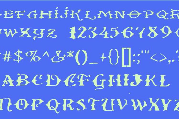
About Ol' Wes' Rustik Font
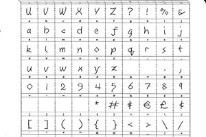
The bad news is in hand drawing this font I messed up, the good news is I decided to continue it anyway. It was originally to pay tribute to the American sign painters in the late 19th and early 20th Centuries. Back then their work was widespread. The characters are done largely in a style of this period. "Thorns" were added to almost all the characters to further enhance the Western look.
Ol' Wes' is a showy way of saying "Old West" . In making the font there was ink bleedthough on some characters (which is the mistake I was refering to) is where the "rusitic" or as I called it "Rustik" part of the name came about.
Back then we had Serif, Script, Text (then considered Gothic) and other font as today. We had font sizes too. One catergory that isn't too widely used nowadays is they used to also separate "printer fonts" from "sign painter's fonts". Printer fonts were fonts such as Cheltenham which was heavily used by the original Montgomery Ward operation almost for the life of the company. First for the catalog, then later once Futura and Helvectica came along for stuff such as newspaper ads and employee handbooks all the way until about 1990 when it was replaced with Serifa. Chetenham is heavily used for signage in Celebration, Florida (at least as of my 1998 visit to the time).
Of course the paper SWMCA type catalogs are no longer availible, but Wards is once again in business as a online only retailer, you can get their current catalog (sorry no Chetenham in it) at www.wards.com .
Playbill was another font of the era that was used heavily on "WANTED" posters and other bills. Of course today a bill means you money just as back then, but "bill" used to have a third meaning
(It's 2nd use was as a name). It meant advertisement or announcement. Back then there were no "classified ads or public notices". Such things were announced using bills or what we now call posters today. At least one thing survives besides these fonts, the phrase "Post No Bills". It means "don't post anything on this wall".
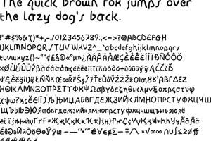
Both Chetenham and Playbill are widely available. You can download them right now from thousands of places, maybe even here at Fontspace. Signpainter font's (which this one is) are very hard to come by. Many even from a brief 1950's and '60's revival (sans-orientation) are no longer available from printers or online. Unlike printer fonts, many signpainter fonts were un-named and were pretty much for sole used by the designer or his crew (back then very few women were in the graphics industry). Some artists would pass there own handwriting with the thorns or swashes as a font. The "handwriting font" is not new, but wasn't called that until very recently. The ending of the Victorian era is the time this font captures.