Dosis Font
by Pablo Impallari
5 font family styles
Bold Style

Book Style

Light Style

Medium Style

SemiBold Style

Designed by
About Dosis Font
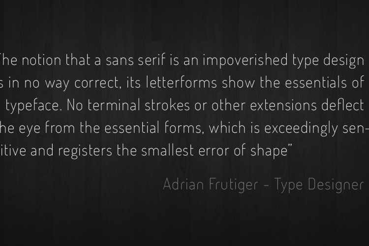
Dosis is a very simple, rounded, sans serif family.
The lighter weights are minimalist. The bolder weights have more personality. The medium weight is nice and balanced.
The overall result is a family that's clean and modern, and can express a wide range of voices & feelings.
It comes in 7 incremental weights: ExtraLight, Light, Book, Medium, Semibold, Bold & ExtraBold
Related Styles
Comments

@WolfLambert Could you point out the Unicode address? I'm not seeing it.

I'm adding this set to my wishlist of type faces to be cast for letterpress printing. Elegant, clean, and beautiful to look at when composed on a single page.

Thank you very much 😄
@WolfLambert Well actually I called it the wrong thing 😞 The CSS character tag is what's given on the Character Map (when you click "view all"). Like the regular lower "g" is at g

@WolfLambert There are 11 glyphs that have no unicode mapping, that is why they don't show up in the charmap. However, these can be used for OpenType features. I should really find a way to show these "hidden" glyphs without having to open up additional software ...
@fontspace Oh, I see now 😛 Shows me for not looking closely enough at the poster. Several alternate characters are used there.

I want to use this font for my college design competition, thanks

Love it!

It's a very nice design.... but lower g bugs me a bit. It doesn't look like it fits in 😕