Love'sLabour Font
by Pia Frauss
Regular Style


Designed by
About Love'sLabour Font
I found the template for this font in an old paperback book on ornamentry. Quite naturally, it's an image copied from a still much older book, showing a sample of writing, entitled: 'Form of a Dainty Slanted Chancery Hand'. The caption in my ornamentry book doesn't name a source, apart from calling the image, hazily, 'Calligraphy, France, 16th century' -- a claim which, obviously, can't be true. For, not only the text, but the style of writing as well, are definitely German. No French calligrapher would have used German to demonstrate his skills, or tried them on such an outlandish blackletter-derived cursive; therefore, I'm left guessing. Since, throughout the centuries, most German writing masters kept publishing their books at Nuremberg, that's the chancery sample's most likely place of origin, too -- but when was it created, and by whom? There are lots of candidates, from Wolfgang Fugger, in the 16th century, to Michael Baurenfeind, at the beginning of the 18th. My guess would be the latter. Lastly, I've come upon an image from Baurenfeind's 1716 book Vollkommene Wiederherstellung der (...) Schreib-Kunst, (= 'Complete Restitution of the (...) Art of Writing' -- believe me, you don't want to know the whole extent of the book's monster title). Said image displays another writing sample called 'Form of...' --, the inital F being an identical twin to the one in my template.
I nearly gave up on this one. There was, of course, no complete set of upper case letters in the writing sample, and the lower case letters, joining delightfully in the image, had an incredible propensity to look out of place when combined in other ways than those the artist had provided. It took a tremdendous amount of time and patience to complete those two sets of characters; and that's why, taking a deap breath at the end, I decided to call the font Love'sLabour. Let me just hope now that it is not entirely Lost.
There is a little hook above the u in this font, which is quite necessary, to distinguish it from the n. And the parentheses look like brackets: they were written like this in the pattern.
The flower ornament in this font is based on a motive I found in a 1664 book on fountain architecture.
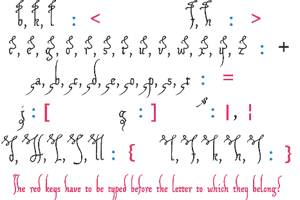
Apart from the long s on the number sign, you'll find some alternate characters, and lots of swashes, in this font. Those are:
a complicated underline swash on the underscore
a more simple underline swash on the bar and broken bar sign
an alternate s on the 'less than' sign. This is the original s from the template. I didn't like it, so I made another, less 'German'-looking, one.
an alternate r on the 'greater than' sign
a swashed l on the left bracket
a swashed h on the right bracket
a swashed b on the long s sign
a swash on the left curly bracket (to be used like an accent)
a swash on the right curly bracket (to be used like an accent)
a swash on the ASCII tilde (to be used like an accent).
Update 2010 has redesigned all of the composite glyphs (correcting the dcaron, Lcaron/lcaron, and tcaron), and enlarged the dashes.