Domine Font
by Pablo Impallari
2 font family styles
Regular Style

Bold Style

Designed by
About Domine Font
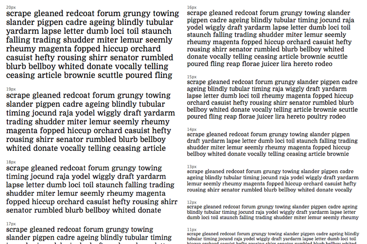
From the very first steps in the design process 'Domine' was designed, tested and optimized for body text on the web.
It shines at 14 and 16 px. And can even be used as small as 11, 12 or 13px.
Harmless to the eyes when reading long texts.
Domine is a perfect choice for newspapers or blogs where text is the main focus.
It's is friendly in appearance because it combines the classic elements of familiar typefaces that have been in use from more than 100 years like Clarendon, Century, Cheltenham and Clearface.
- The rounded letters (b, c, d, e, o, p, q) are a bit squarish on the inside. This feature opens up the counters for better rendering and also make it look a bit more up-to-date than the classic typefaces previously referenced.
- The serifs are a bit shorter than usual. Another feature that improves the rendering by allowing more "air" between each letter pair.
- The joins of the stems to the branches in letters like h, m, n are deep enough to prevent dark spots, also improving legibility at small sizes.
- The friendly lowercase 'a', with the curve starting from the bottom of the stem, is reminiscent of Cheltenham and Clearface. That soft curve is also echoed in the curves of the f, j, n, m and r.
- The spacing is also optimized for body text on the web, clearly more open than that of typefaces made for print or for headlines.
Project Members: PabloImpallari, BrendaGallo, RodrigoFuenzalida


Beautiful! Any plans to add ital to this set?