Fractur Font
Designed by
Regular Style

License Info
Fractur Font Stats
Fractur Font is a Old English font and was created on . Fractur Font has been downloaded 6,269 times, added to 63 collections, and liked 4 times.
Fractur Font was recently updated on Nov 13, 2007
Related Styles
Comments
Compare to both original rather similar German fonts: Schmalfette Fraktur; Schmale deutsche Anzeigenschrift. The difference between the Anglo-Saxon and the German fonts is that the latter do have always bounding elements between some letters, thus making only one of two letters, like f and i , long s and t, t and z, c and h, and so on. They are called Ligaturen in German. Also, long s letters are a must in German texts; normal round s letters are used along with them in the same text, but not instead.
One could make a truly similar to Wittenbach font while adding Umlauts and a long s out of f within one hour
All the 3 above mentioned narrow fonts are needed explicitly for CD/DVD and web inscriptions.
Now, after 9 years later on, the font has grown to the most preferred one for all kinds of inscriptions ever;
thanks to the author, I'm using it all the day round along with the FracturCondensedHeadline font.
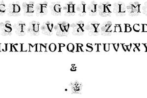
The true name of this font is Wittenbach. However, while being digitalized, the big Z has grown too much; also, the long s is missing. This is of importance in the case of German texts.