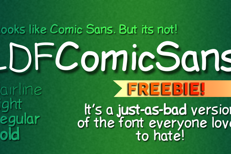
LDF Comic Sans Font

Designed by
4 font family styles
Medium Style

Bold Style

Hairline Medium Style

Light Style

More info from Jake Luedecke Motion & Graphic Design
A free alternative to the most hated font on the face of the earth. Feel free to use it commercially, not that you'd want to.
License Info
Donations
LDF Comic Sans Font Stats
LDF Comic Sans Font is a Comic Sans font and was created on . LDF Comic Sans Font has been downloaded 239,612 times, added to 937 collections, and liked 51 times.
LDF Comic Sans Font was recently updated on Aug 18, 2021
Related Styles
Comments

This is actually an improvement on Comic sans. What killed the original's ability to look like handwriting was its computerised metrics. But this mutated version kills the metrics, making it a better handwriting font. Perhaps not the most convincing, but it's still better.

@Nate547 Thanks, I didn't include C, I, J, r and s. I also made the t differently.
@WolfLambert thanks!

Thank you so much 😄 Commercial use is an added bonus!!

I'm rather embarrassed to ask this, but just why does everybody hate Comic Sans so much? I mean, I was never crazy about it (I can't put my finger on just what it is that seems so different (and so much more pleasing!) about this one), but I don't particularly hate it or even especially dislike it any more than any of the other boring and/or overused fonts that tend to be included with commercial operating systems (Times Roman, Helvetica, the various Arials, etc.). (I always get stuck using one of these (or a variant that includes certain special characters) when I'm using a regular commercial word processor because they're the only ones that have a decent variety of the math characters I need. Though even most of these aren't adequate for anything involving matrices...STIX Math, a SIL font by Elsevier, is the best one I've found (at least, the best open-source one, and better than a lot of commercial ones: its chief flaw is its resemblance to Times Roman ).)
Nate: many (would-be) handwriting-look fonts suffer from the problem that you cited, but some of these are popular in spite of it, and most are, at least, not so universally despised that it's actually become a running gag, as with Comic Sans. I'm not sure convincingness (convincingocity? convincingitude?) is always the first thing everybody looks for in hand-style fonts, although it is certainly important.
@viperrific First of all, Comic Sans is hated 1. because of its over-usage in inappropriate situations (which is because of the user, not the font) and 2. Because of (like you said) the metrics and bad kerning of the font. That takes out the human element of the font.
Also, people have a tendency to join these crusades of hatred to a subject (Justin Bieber for example) because we feel the need to conform. Basically, we love to hate things.
Honestly, I don't hate Comic Sans, I just made this font to see if I'd be able to replicate and improve it by adding 2 new weights.
(Thanks, BTW!)
Jake —
You make an excellent point. I recall that when I was in college, people seemed to enjoy talking about how terrible the second and third _Matrix_ films were than how good the first one was; more currently, Justin Bieber sometimes seems to be the New Kids on the Block of his time (the band everyone loved to hate when I was a teenager). (I think this is a Gen-X phenomenon, or at least that's its origin: it has that cynical, dry-humour-at-someone-else's-expense quality.)
(I guess I'm dating myself here. I hope that a certain bloke from a certain online dating site whom I'd convinced that I was 24 isn't reading this. 😄 )
What sort of inappropriate situations is Comic Sans used in? I don't think I'd noticed that part.
-Viperrific
@viperrific Danger signs, funeral home invoices, the list goes on... http://m.now.msn.com/comic-sans-used-inappropriately

Literally the only reason I'm downloading this is cause I really like a character from a video game called "Undertale" that uses this font t(-_-t)

That's a Lumpy Font

I considered Comic Sans is the least favorite font because of poor kerning and very ugly done metrics.

Honestly I don't know why everyone hates it ITS A PERFECTLY FINE FONT I have no idea what is wrong with it.
Maybe people have bad taste I don't know.
All what I see is a perfectly fine font.
I will say I've never really went crazy or hated the font its just "fine".
Would anyone tell me why Comic Sans is so "bad"?


Nice font. I like it 😄