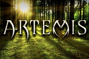
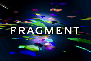
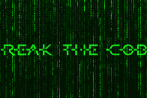
bowarrow2 Font
Medium Style

truetype 83 glyphs 103 characters
More info from JoannaVu
This one was also made to resemble the “ARROW” logo, but, unlike the original bow&arrow font, decorative elements were reduced to a minimum so that it is more “usable”. Have fun with it, and any feedback is more than welcome. :)
License Info
Freeware, Non-Commercial
Donations
Commercial licenses
Contact the designer to purchase a commercial license, if needed.
bowarrow2 Font Stats
bowarrow2 Font is a Arrow font and was created on . bowarrow2 Font has been downloaded 4,148 times, added to 51 collections, and liked 5 times.
bowarrow2 Font was recently updated on Oct 8, 2019
Related Styles
Comments
Be the first to comment!

