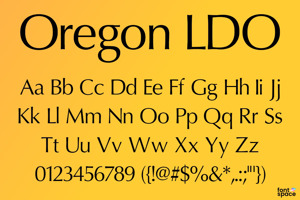
Waukegan LDO Font
Designed by
12 font family styles
Regular Style

Black Regular Style

Black Oblique Style

Bold Style

Bold Oblique Style

Extended Regular Style

Extended Black Regular Style

Extended Black Oblique Style

Extended Bold Style

Extended Bold Oblique Style

Extended Oblique Style

Oblique Style

More info from Luke Owens
Waukegan LDO is based on Eurostile, which is in turn based on Microgramma.
This version has looser metrics in the extended faces, giving a more open feel to the font and making it more appropriate for modern display advertising, while retaining a tighter set of metrics for the text variations.
License Info
Donations
Waukegan LDO Font Stats
Waukegan LDO Font is a Eurostile font and was created on . Waukegan LDO Font has been downloaded 198,862 times, added to 839 collections, and liked 34 times.
Waukegan LDO Font was recently updated on Aug 28, 2007
Related Styles
Comments

well, i'll download it now!
12-19-2010
used for a contest on 99designs

Correct me if I'm wrong but to me it looks like many letters of the bold and italic variants have just been automatically thickened/slanted. That much everyone can do by him-/herself without downloading an extra font.
(No offense intended)
This is just a knockoff of the Eurostile font.
@FreeWilly You are not wrong.
I'm not making you angry, but, why doesn't the
Q have the other part of the stroke outside the O? It's okay in Calibri, since the other part of the stroke is missing in the inside...