Jane Austen Font

Designed by
NoSecret Style

More info from Pia Frauss
Paying homage to a favourite author can be a painful and tricky thing, so please don't suppose that this font, though made up out of characters written by Jane Austen, is really quite equal to her handwriting. Like every intelligent person, she commanded lots of varying letter forms, depending on the way those letters were connected, and their position in a given word. Her words are clearly diminishing towards their endings. Her i-dots are flying around a good deal, but of course they never collide with other characters (which will happen inevitably, when they are fixed in a font), and, worst of all, her strokes will sometimes look rather blotchy and sometimes rather thin, depending on how many ink was in her pen at a given moment -- and had that pen been recently mended, or was it in urgent need of mending? -- so that it's next to impossible to decide on their intended broad- or thinness. However, creating something like an average image has been the aim of my font, and naturally, this has endowed it with the principal flaw of all typefaces: it's looking far too regular.
Jane Austen lived at an epoch without typewriters, when people were strictly trained to adopt a conventional style of handwriting. I strongly suspect that, left to herself, she would have done what graphologists -- and font-makers -- hate most, i.e. flattened out her words in a long wavy scrawl. Yet legibility had to be (and was indeed) a chief concern of hers. So she is rather closely following the Bickham model, as well as given to bettering, i.e. to rework on perusal those of her letters that don't look quite identifiable to her. This is best observed with the x, which tends from the first to be her most illegible letter, shrinking occasionally to a mere knot in the word, with a tiny sharp edge to it. Time and again, she has re-x-ed it, covering it with an unmistakable, spelling x.
Most deplorably, this trait has begot a weird theory launched by graphologists, which enlightens us as to Jane Austen's habit of intentionally blackening her os -- indicating thereby that she had, and was guarding, a secret! When I first learnt about this -- long after I had begun work on my Austen-font --, I was dumbfounded. For, honestly, I had never been aware of such a characteristic, which means, in fact, that, being far from general, it even cannot occur that frequently. Revision of my material confirmed this view: there may be black os, and es, and as, and gs, etc. strewn over the texts, but they may easily be explained, either by Austen's tendency to produce narrow-shaped letters (while connecting tends to be spacious, spreading still more ink in the letters' center by way of lead-ins and lead-outs), or by her retouching them, and doing a bit too much on spots where her pen, leaving nearly a blank, had formerly done too little. All of them are more legitimately to be considered accidents than intentional styling features. And, since the open forms of all such letters are plainly prevailing, no "black letters" have been included here -- which is why my font has got the subfamily name NoSecret.
Of course, the idea is ridiculous. People who are guarding a secret, will do their utmost to keep others from even suspecting that they are hiding something. So how should graphology find out about the way in which, if at all, this affects their style of writing? But since we are all of us tantalized by that most important question about Jane Austen, "Why did she never marry?", graphology has now entitled us to surmise what we have always suspected, i.e. some deep-rooted, unquenchable, unfulfilled passion at the bottom of her soul, which kept her a spinster all the days of her life. Feeling rather disgusted at such a notion, and dismissing the whole thing as downright, if not greedy, nonsense, I went back to my material … -- and then it dawned on me that, objections, ethics, and empirics notwithstanding, such guesswork, for once, might have hit the very point. Jane Austen had indeed, not one, but two secrets. Her first secret was the meaning of Mansfield Park, and her second the storyline of Emma. After the publication of each of those two novels, she began to keep a journal, writing down the statements of every reader she could get at. Why should she do this? The most probable solution seems to be that she wanted to know if her readers were able to find her out, and in case they weren't, to keep track of their ways of misreading her. Now, as to Mansfield Park, I'm not up to date. There may have been developments those last few years. But concerning Emma, I can safely swear that the author's secret is as sound and secure as it was when she took it to the grave. No literary critic in this whole wide world will be able to tell you what really happens in that most ingenious of all novels. Therefore, I now consider producing a "Secret" black-lettered follow-up font, after all.
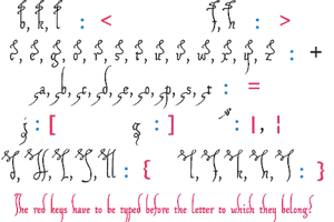
There are some peculiarities to this font.
on the number sign, you will find a complete the. Its best used at the beginning of a word (the ending e has been redesigned in 2010, to allow joining other characters to it).
On the Dollar sign, you'll find an alternate Z.
The section sign has been replaced with an alternate C, sitting on the line (as opposed to the regular one, reaching far below).
The + sign will show up as an ing. It's meant to be used at the end of a word, and will look a bit odd when employed in words like "finger".
The = sign contains a ds, likewise taken from a verb-ending; nevertheless, this one won't look too bad when placed in the middle of a word.
On the degree sign, you'll find a gr, which should adapt well to all contexts.
The abbreviation Mr. is to be found on the less sign, and...
...the abbreviation Mrs. on the greater sign
The left bracket contains an alternate z.
The right bracket contains an alternate d -- to be used at the end of a word.
On the left curly bracket, you'll find an alternate R, sitting on the line (as opposed to the regular one, reaching far below).
On the right curly bracket, there is an alternate U, which is fit, moreover, in shape as well as metrics, to be used as a double l.
The bar and broken bar sign have turned into an alternate A.
The Euro sign has become an alternate E.
The Yen sign has been transformed into an alternate H.
The + sign has moved on to the dagger.
The = sign will be found on the double dagger.
And the degree sign has flown off to the lozenge.
For reasons which I leave open to guessing, there is only one currency included in this font, e.g. the Sterling sign; and if you really want to write like Jane Austen, you'll have to employ the German ligature ß -- since she is very consequently and constantly using it for a double s. Last of all, I had to invent the X. For the life of me, I couldn't find one penned by Jane Austen. So, if you can procure me a sample of words like Xanadu, or Xerox, or Xerxes in her handwriting, I promise to update my font as speedily as possible.
Finally, if you want to make comparisons, or just to form some ideas of your own as to her more or less blackened os, I recommend you take a look at a very fine facsimile of a Jane-Austen-letter. Thanks for listening.
Update 2007 has made the question and exclamation marks more slanted (and their reversed versions as well!), corrected the Ldot/ldot sign, and altered the spacing of some quote signs.
Update 2010 has not only redesigned the composite glyphs, and corrected the dcaron, Lcaron/lcaron, and tcaron, it has also corrected a glitch on the cdot, enlarged the dashes, and added 764 kerning pairs.
License Info
Donations
Commercial licenses
Jane Austen Font Stats
Jane Austen Font is a Antique font and was created on . Jane Austen Font has been downloaded 10,184 times, added to 386 collections, and liked 15 times.
Jane Austen Font was recently updated on Mar 7, 2020
It is nice and clean