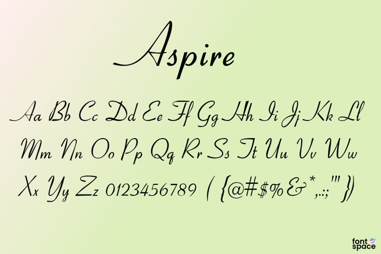
Aspire Font
Designed by
DemiBold Style

License Info
Aspire Font Stats
Aspire Font is a English font and was created on . Aspire Font has been downloaded 951,383 times, added to 6,776 collections, and liked 229 times.
Aspire Font was recently updated on Apr 4, 2020
Related Styles
Comments
My new handwriting!

awesome! 😄

This is the prettiest font ever! <3

Sweet. 😄

This is so cool it looks like my mums writing:-)
nice profile pic@ghprod
i like this (:

Thank u, very nice font!

It is beautiful.
Awesome & Mind blowing....font
Sooo cool!! 😃 I'll use it more often!
Thanks! nice font
This is perfect for my wedding! Thank you. Now, a question....it is downloaded but how do I get to it to actually use it?
Can the creator of this font correct or add the minus sign. Under Win7 it doesn't display - shows up as a rectangular outline or nothing at all depending on the software used.

@DataKnight A bit late, but since this is a public domain font, I found the misplaced hyphen and glued it back where it belonged. I also added some more punctuation, and reduced the size of the @ sign. It's still a bit big, but not as ridiculous.
And, as an afterthought, I reduced the size of the space between words.
@fontologist
Thanks for sorting it out.
Happy New Year !

This is AWSM!!

Tooooooooooooo good not to catch my eye
@mediastudent This is one version of a much copied typeface designed in 1937 by R. H. Middleton and probably best known by the name Coronet. For a long time it was one of the default Windows fonts under that name, and may still be, for all I know.