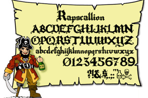
What a great font! A variation of it, with the lighter color at the bottom instead of the top, with the bases of the letters narrower and tops wider, and with the mid-parts of the letters, the horizontal strokes (such as in E, A, F, H) raised a little higher, would make a great, spooky, "flashlight from the bottom" font.


What a great font! A variation of it, with the lighter color at the bottom instead of the top, with the bases of the letters narrower and tops wider, and with the mid-parts of the letters, the horizontal strokes (such as in E, A, F, H) raised a little higher, would make a great, spooky, "flashlight from the bottom" font.