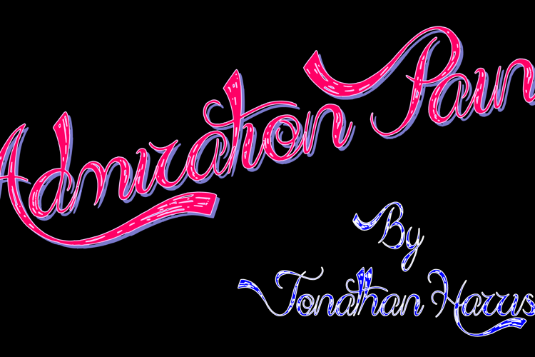
Admiration Pains Font

Designed by
Regular Style

More info from Jonathan S. Harris
► Commercial Licenses: https://jshcreates.com/
► BONUS CONTENT: https://www.patreon.com/JSHcreates
You may use this version of 'Admiration Pains' for personal use only but if you wish to use it commercially you will need to purchase a license. Please visit https://jshcreates.com/product/admiration-pains-font/ for details.
License Info
Donations
Commercial licenses
Admiration Pains Font Stats
Admiration Pains Font is a Fancy font and was created on . Admiration Pains Font has been downloaded 202,694 times, added to 2,102 collections, and liked 25 times.
Admiration Pains Font was recently updated on Nov 15, 2024
Related Styles
Comments

I 'almost' love this one... unfortunately, the formation of the N and M's make it a rather difficult read especially when paired with the i's (which have no dots, thus making it even harder to read). For instance the 'Pains' looks like Pauns, and the Admiration looks a bit like Adnization
Otherwise, it's pretty awesome.

nice one

I love this one definitely one of my favorites.
@MzPepper your right its is hard to read in some letters but the whole font is really pretty especially with the capitalized "p"


Very nice! 😃