Cabin Condensed Font
Designed by
4 font family styles
Regular Style

Bold Style

Medium Style

SemiBold Style

More info from Pablo Impallari
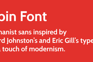
This is the condensed set of styles in the Cabin font family; a humanist sans with 4 weights plus true italics, inspired by Edward Johnston’s and Eric Gill’s typefaces, with a touch of modernism.
Cabin incorporates modern proportions, optical adjustments, and some elements of the geometric sans.
It remains true to its roots, but has its own personality.
The weight distribution is almost monotone, although top and bottom curves are slightly thin.
Counters of the b, g, p and q are rounded and optically adjusted. The curved stem endings have a 10 degree angle. E and F have shorter center arms. M is splashed.
License Info
Cabin Condensed Font Stats
Cabin Condensed Font is a Condensed font and was created on . Cabin Condensed Font has been downloaded 12,585 times, added to 126 collections, and liked 11 times.
Cabin Condensed Font was recently updated on Dec 13, 2012
Related Styles
Comments

^ Gill Sans haters gonna hate. 😉

@Spacini Hecks yeah-- Gill Sans be wack, yo! LMAO
colingwest
Cabin condensed. A useful and well designed font. You can fit more onto a page without it looking cramped.
For this purpose use 14pt and 1.5 line spacing.
Nice. It's the closest free font I could find to Avenir Next Condensed.
The Regular/Bold/Medium/SemiBold naming order seems to be scrambled. From light to heavy, I see Bold/Regular/SemiBold/Medium, and the last two are very close.
Any chance of a change to the numerals so they are all the same width? Or a clone of this otherwise wonderful font with that one change?
Fortunately this design is 98% less sickening than Gill Sans 😛 I like it 😉