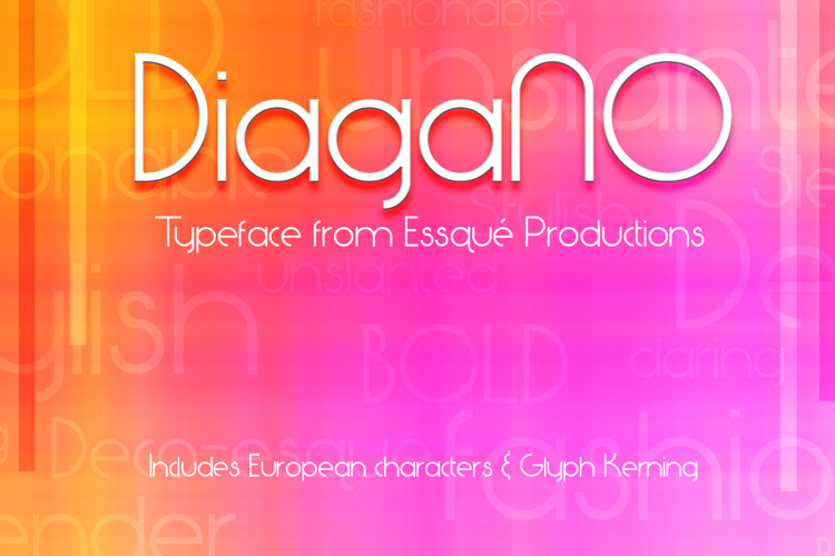
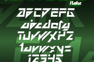
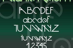
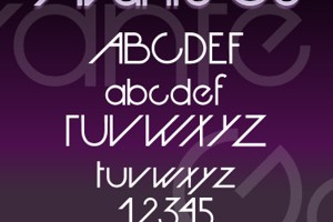
DiagaNO Font

Designed by
Regular Style

More info from Essqué Productions
It all started with the letter "Q". I had an idea to create the tail going straight up and down...similar to the "power" symbol on many electronics. Then I thought, "What would the alphabet look like if we couldn't or didn't use diagonal lines?" This is the result...nothing connects, aligns, or cuts unless it is on a multiple of 90° angles. The font ended up having a slight geometric/art deco feel to it.
For commercial use, please visit http://www.essque-productions.com/shop/fonts/diagano.html
License Info
Donations
Commercial licenses
DiagaNO Font Stats
DiagaNO Font is a Geometric font and was created on . DiagaNO Font has been downloaded 7,976 times, added to 95 collections, and liked 7 times.
DiagaNO Font was recently updated on May 25, 2021
Related Styles
Comments

@arey40433 Thanks! Glad you like!
too cute!