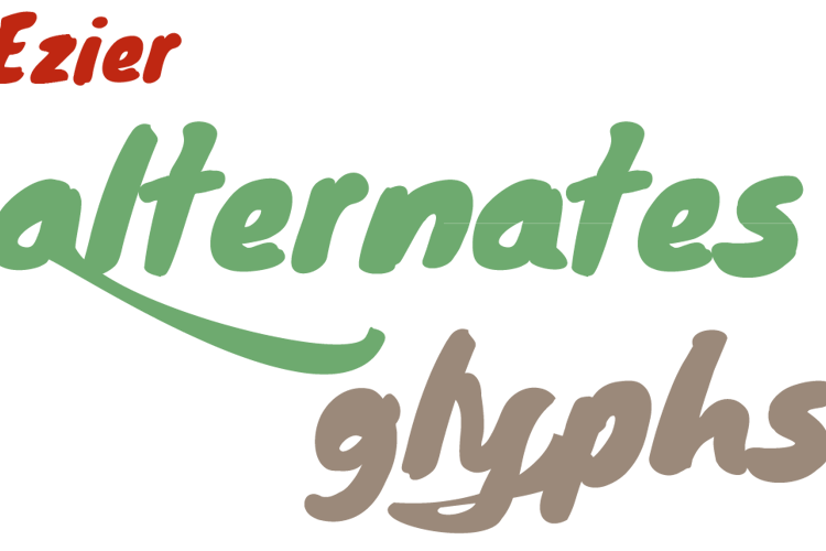
Eziear Font

Designed by
Regular Style

truetype 215 glyphs 210 characters
License Info
Freeware
Eziear Font Stats
Eziear Font is a Alternates font and was created on . Eziear Font has been downloaded 1,283 times, added to 11 collections, and liked 3 times.
Related Styles
Comments

FreeWilly
13 years agoHonestly, if there was correct spacing/kerning, the font would be usable.


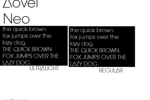

Adding kerning would really help, or adjusting the left side bearing of the characters with descenders the "y" glyph shown above in the preview.