FranciscoLucas Font

Designed by
2 font family styles
Regular Style

FranciscoLucas Llana Style

More info from Pia Frauss
FranciscoLucas Llana was written at Madrid in 1570, by a man called Francisco Lucas. Employing the Spanish term for a cursive hand, he called it a Bastarda; but technically speaking, it is a humanistic cursive -- the style of writing which is mostly known under the name of Chancery. Reworking Mr Lucas' glyphs has been my first attempt to produce something like regularity; and of course, no Ks and Ws being needed in Spain, I had to dream them up myself.
FranciscoLucas Briosa is an alternate and more swashed version of FranciscoLucas Llana, designed after an alphabet of capitals created by the same writing master, and in the same year 1570.
Update 2010 has not only enlarged the dashes and redesigned all of the composite glyphs, in both fonts (and corrected the dcaron, Lcaron/lcaron, and tcaron, of course), it has also given FranciscoLucas Llana a new E, W, g, and y. As a consequence, the alternate glyphs, which were formerly the same in both fonts, are now different.
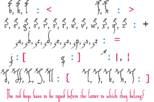
In FranciscoLucas Llana, you'll find the the following alternate glyphs:
the former g instead of the left bracket
a plain z instead of the right bracket
the former E instead of the left curly bracket
a slender K instead of the right curly bracket
a slender Z on the bar and broken bar sign.
In FranciscoLucas Briosa, you'll find the the following alternate glyphs:
a rather condensed g instead of the left bracket
an alternate y instead of the right bracket
an alternate E instead of the left curly bracket
a very swashed R instead of the right curly bracket
a final e instead of the bar and broken bar sign
Both fonts have a double long s on the long s sign, as well as a st and a ct ligature on the fi and fl keys (in case the fi and fl signs aren't reachable on your computer, you might try the masculine and feminine ordinal indicators, or the 'less-than or equal to', and the 'greater than or equal to' signs). There is no number sign in these fonts. In its place, you'll find a long s.
Update 2007 had reduced the files' size, by redesigning the composite glyphs, and corrected some flaws -- above all, an error concerning the lcedilla sign.
License Info
Donations
Commercial licenses
FranciscoLucas Font Stats
FranciscoLucas Font is a Spanish font and was created on . FranciscoLucas Font has been downloaded 10,834 times, added to 142 collections, and liked 7 times.
FranciscoLucas Font was recently updated on Oct 29, 2015