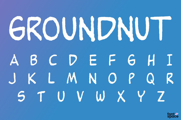
Groundnut Font

Regular Style

More info from John K. Barrow
Aestheticware‐‐‐If you use this font or even just like it, you MUST do something to make the world look a little better. Violators will be shot‐‐‐Based on the friendly handwriting of Charles "Sparky" Schulz ‐‐ Alternate characters included
License Info
Groundnut Font Stats
Groundnut Font is a Peanuts font and was created on . Groundnut Font has been downloaded 126,520 times, added to 837 collections, and liked 63 times.
Groundnut Font was recently updated on Jan 6, 2020
Related Styles
Comments

Could use a few more characters but I still like it 😄

Very cute! I also have to admit that I love your terms for commercial use (I also had a good laugh at it, lol) 😃 Thank you for creating and sharing this font.

As I said of the previous version of this font, it would be more useful with numbers, extended Latin letters (especially umlauted vowels and a versal eszett, given Schulz's German heritage) and more punctuation.
Just what I was looking for. Thank you! (Always trying to make the world better!)
Just like the preview above, I often have several letters "clump" over each other, which often makes this font impossible to use. I was hopeful, but unable to fix it. Anyone know how to fix/avoid this problem?

Please fix the font! This font is buggy!

There is a bug in the "character width" or "kerning hints" for the lowercase letter K. After hitting k followed by any other letter (but not punctuation) the position jumps back several characters. Is there a font debugging tool I could use to patch this?

Note: work-around: since this font is all small-caps anyway just use a capital K instead of a lower K.

I fixed the font by redefining the lower case K glyph. Get a copy here https://github.com/PeterTheobald/goundnut-font-fixed

Thanks for the beautiful work! You might like to know that people sell this on Etsy for $2

Oops fixed the repo spelling: https://github.com/PeterTheobald/groundnut-font-fixed
Excellent for comics! THX a million 😉