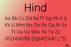
Kalam Font
Designed by
3 font family styles
Regular Style

Bold Style

Light Style

More info from Indian Type Foundry
Kalam is a handwriting-style typeface supporting the Devanagari and Latin scripts. This is an Open Source font family first published by the Indian Type Foundry in 2014.
Even though Kalam’s letterforms derive from handwriting, the fonts have each been optimised for text on screen. All in all, the typeface is a design that feels very personal. Like many informal handwriting-style fonts, it appears rather fresh and new when seen on screen or printed on the page. Kalam’s letterforms feature a very steep slant from the top right to the bottom left. They are similar to letters used in everyday handwriting, and look like they might have been written with either a thin felt-tip pen, or a ball-point pen. In the Devanagari letterforms, the knotted-terminals are open, but some other counter forms are closed. Features like these strengthen the feeling that text set in this typeface has been written very quickly, in a rapid manner.
Kalam is available in three weights: Light, Regular and Bold. Each font contains 1,025 glyphs, which includes many unique Devanagari conjuncts. These ensure full support for the major languages written with the Devanagari script. The Latin component’s character set is a basic western one, which enables typesetting in English and the other Western European languages. Lipi Raval and Jonny Pinhorn developed the family for ITF; Raval designed the Devanagari component while she and Pinhorn worked together on the Latin.
License Info
Kalam Font Stats
Kalam Font is a Devanagari font and was created on . Kalam Font has been downloaded 15,807 times, added to 204 collections, and liked 6 times.
Kalam Font was recently updated on Jul 8, 2014
Related Styles
Comments
Finally a handwriting that's easy to read! And I really appreciate that special characters are supported 😄

It's a nice font, and my students like it, but if they are doing bullet lists in a Google Slides Presentations the Bullet Points default to a square.

Simple and cute, I like it 😄