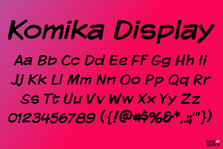
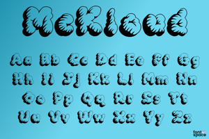
Komika Display Font
Designed by
10 font family styles
Regular Style

- Shadow Regular Style

Bold Style

Kaps Regular Style

Kaps Bold Style

Kaps Wide Regular Style

Kaps Wide Bold Style

Tight Regular Style

Wide Regular Style

Wide Bold Style

More info from Apostrophic Lab
As of January 2000, there surprisingly STILL weren't enough quality freeware comic fonts out there to support the masses who couldn't (or didn't want to) buy Comicraft's and/or Ethan Dunham's commercial stuff. In fact, throughout the short history of freeware fonts, there's only been a handful of designers out there who were offering comic fonts. But as of January 2000, there weren't as many of them left out there. The only 3 freeware designers who were dedicating serious time to comic fonts were Nate Piekos, at Blambot, who is still releasing very nice comic letters (albeit with strictly Anglo character sets), Dan Zadorozny at Iconian, who still releases some interesting comic letters (also mostly incomplete character sets though), and Derek Vogelpohl, who came up with massive packages such as Action Man, Cartoonist Hand, Toon Time, Toon Time Extras, and Wonder Comic. All the other boys and girls seemed to have burnt out on the comics for some reason. Ray Larabie did one or two comic fonts a while ago, but from the fall of 1999 he seemed to have picked different routes for his font work. WolfBainX had a massive archive happening at his Vigilante Type site, but for the most part the comic kick he had was lost among his experimentation with grunge and swash, and the character sets were not complete at all, which made. A new name was sort of being thrown around freeware font circles: Dave Hyatt. Dave did a few cool ones, but nowhere near the quality we'd seen with Derek's stuff.
To make a long story short, most of the comic fonts out there were very English-oriented, which left the Italians, French, Spanish, Swedes, Icelandics, etc, out of the loop, and independent comics in those countries were still being lettered with Tekton or Comic Sans, which you probably agree can end up blanding things out after a while. I suspect Derek took some of that pain away from those folks.
Some time during January 2000, WolfBainX and I were yakking it up and I asked a question which I suppose ended up costing me too many hours of sleep to count now. The question was: "How about a complete comic lettering system for the folks out there, Wolfie?" I intended that question to be a prod at WBX, maybe a guilt trip to get him thinking about comic fonts again. But after talking it out with him for a while, we decided that he had enough diamonds in the rough on his site to actually start a formidable base for the massive project that I was proposing. From then on it was just me and my amusement. Shortly after that conversation, WBX and I finished up the lab's expansion of his Tribal font, but then he disappeared and I couldn't get hold of him since. The original Vigilante site went down about a month later, and because I was too busy with the lab, CybaPee, bless her heart, hosted the old Vigilante archives instead of me having to go through the trouble of doing it.
Note to WolfBainX: I hope you are having a good time. I think you got hitched without telling me, you ole dawg. Drop me a line when you read this. Here's looking at you, comic fonts, and whatssername's butt with yer tattoo on it. Cheers, man. Thanks for everythang.
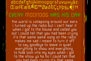
For the first time in a massive lab project since Republika, I somehow managed to stick to the original plan, though many times I built and demolished many fonts before always coming back to the original charts. The original plan was to have 5 10-font packs which would constitute a complete lettering system for the comic artist, whether professional, independent, amateur, beginner or whoever wants to use the stuff. The biggest worry for any comic artist in these digital days, when it comes to letters, is what goes inside the speech, narration and thought balloons. I took care of that with Komika Text, which is based on WBX's Sunday Komix letters. Then there are the titles and the cover type, of course. Those are accommodated with Komika Display and Komika Title, based respectively on WBX's Komixation and Supermarket Sale letters. To add variety and flexibility to the superset, 10 more fonts were added in a Hands set, all of which can theoretically be adequate substitutions for the text, display and title sets, depending on the application. These supposed "anternative" fonts turned out very nice, and in certain respects are even better than the main sets.
40 fonts later, I got down to the part that was the most fun. If you have ever picked up an old comic book and observed it closely, you may have noticed the one typeface that really stands out and is used only once throughout the whole work. Every comic book has one of those. It's where the artist's imagination shows most. Some of the old Flash comics had that beautiful logo that raised the whole book to a different level of komix art. Same deal with the old Spiderman and Superman stuff. Since the computers took over the letterer's job, that sort of thing is very scarce now, and most unique superhero types end up looking like a sports team's logo. That's of course bad news for the komix fans, but that's the way it goes. In fact, it may be a good thing when one considers that these are the kinds of touches that make the artists stand out from the digital assemblers. Anyone can grab a bunch of fonts and slap them on someone's drawings then call it a comic book, but not everyone can actually draw enough perspective from the drawings to actually base lettering on them.
At any rate, this was the problem I was facing: as much as I wanted to include something in Komika to help the artist/assembler with that sort of unique type that can stand out in its once-only use, I realized that I probably won't be of much help. No superset of anything would help the ones who cannot feel the drawings themselves. But to say that I tried, and for the sake of comprehensiveness, I included a Komika Poster set of 9 fonts that may or may not stimulate the imagination. The variety there includes letters that are cracked, sketched, treaded, spooked, discoed, and that sort of thing. Use these on covers and posters, but make sure that you're using them at 40+ sizes, otherwise you may be subjected to much snickering and eyeball rolling.
And the end of it was of course a font that includes some comic balloons for speech and narration and all that jazz. I actually don't recommend using these balloons (if you're a comic artist, you already know that trying to use pre-made balloons can be much more trouble than actually making your own), but I included them to give anyone who is beginning in the field an idea on how these things can look like. So thoughtful, am I not?
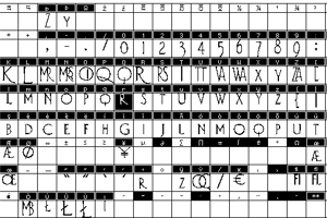
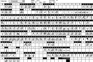
Another good thing about this Komika set that you now have is that it can accommodate many markets when it comes to language support. Even the 2 Swedish characters, 4 Icelandic characters and 4 Spanish/Portugese characters are all included in there. This is something that you will hardly ever find even in commercial comic fonts.
Three cheers for WolfBainX for supplying the solid base of this set.
For the record: when I was a kid I loathed Lulu, Archie, and Asterix. My favourite comic books were Herg's Tintin series, Lucky Luke, Chevalier Ardent and Michel Vaillant. Gotta give it to the French when it came to gorgeous comic lettering back then. About a month ago I went to the French Centre here in Toronto and checked out some of the latest French comic books. I was disappointed. Everything is so computerised now. The clarity and distribution of the old komix just isn't there anymore. Rand would have a fit, I tell you. Nowadays it's adrenaline, testosterone, estrogen and starkness covering mediocre pop art intended to sell the moment. The world knows it very well too, I guess. There's a Tintin shop right off Market Street in San Francisco, where all the old French comic paraphenalia is priced like jewelry. Right across the street from that shop, there's a "collector's" comic book store that deal in post-1985 comics. The difference is quite clear between both stores, in quality as well as in price. Ah well. Here's to mediocrity and paying now for nothing. Milles tonnerres to Brest, as the Captain would say.
So there you have it. 50 fonts and a huge load off my shoulders now. I hope you use them in good health. Please let me know at apostrophe@apostrophiclab.com if, where and how you use them. If you do use them in commercial projects in which you make some profit, please take the time to give a small fraction of that to your favourite charity.
Later gator, 'nawhile crocodile.
License Info
Komika Display Font Stats
Komika Display Font is a Comic Book font and was created on . Komika Display Font has been downloaded 17,421 times, added to 281 collections, and liked 13 times.
Komika Display Font was recently updated on Dec 30, 2019
Related Styles
Comments

COOL!!! 😃
Appreciate the special characters! Thank you 😄


Good for comics and cartoons, THX!