Leipzig Fraktur Font

Designed by
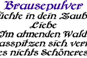
5 font family styles
Bold Style

Heavy ExtraBold Style

LF Bold Style

LF Normal Style

Normal Style

License Info
Donations
Leipzig Fraktur Font Stats
Leipzig Fraktur Font is a Fraktur font and was created on . Leipzig Fraktur Font has been downloaded 6,685 times, added to 157 collections, and liked 5 times.
Leipzig Fraktur Font was recently updated on Jul 25, 2019
Related Styles
Comments

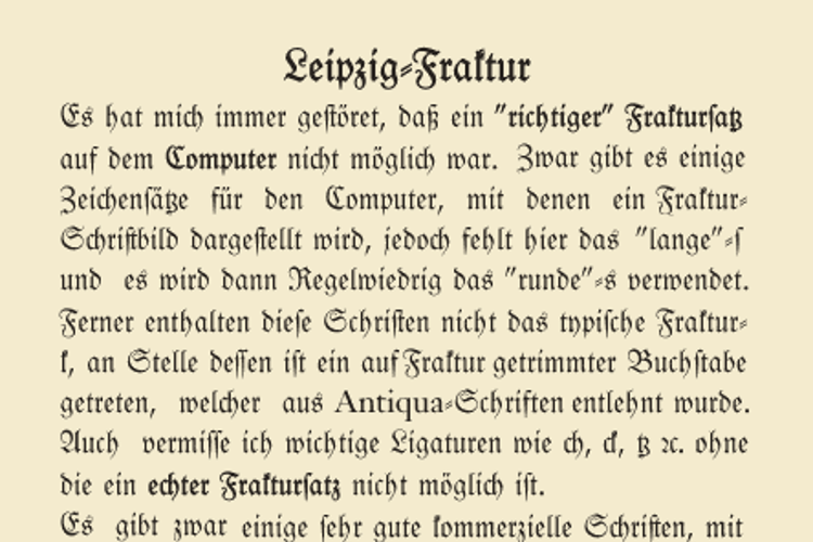
This would be fine, but is some complicated:
First, there are much more rules, where thr round s is used in blackletter writing, so in Germany, we do use a lot of composed words, and there, at the border between such a word-combination, also the round s is used. There are also a lot more things, so only s instead of ſ only at the end of the word will be wrong.
The second thing: To do such a replavement, you have to use smartfont technologies, Unfoutunately there are 3 different: Apple is using AAT, OpenOffice and LibreOffice and a lot of software coming from the open source community is using Graphite (which is hard to implement, because there is no graphical tool to do this) and the major professional designtools, as InDesign or Illustrator is supporting OpenType, but the mass of private used software isn't supporting anything of this.
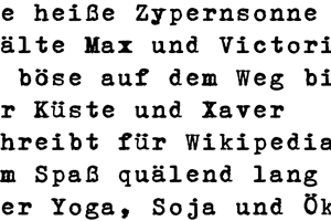

If you want to make it really cool, make it so it's normally the long s, with the regular s appearing only if it's at the end of a word. For short passages, I guess a user could substitute the s glyph from the "LF" versions whenever it appears at the end of a word...