Mom's Typewriter Font

Designed by
Regular Style

More info from Christoph Mueller
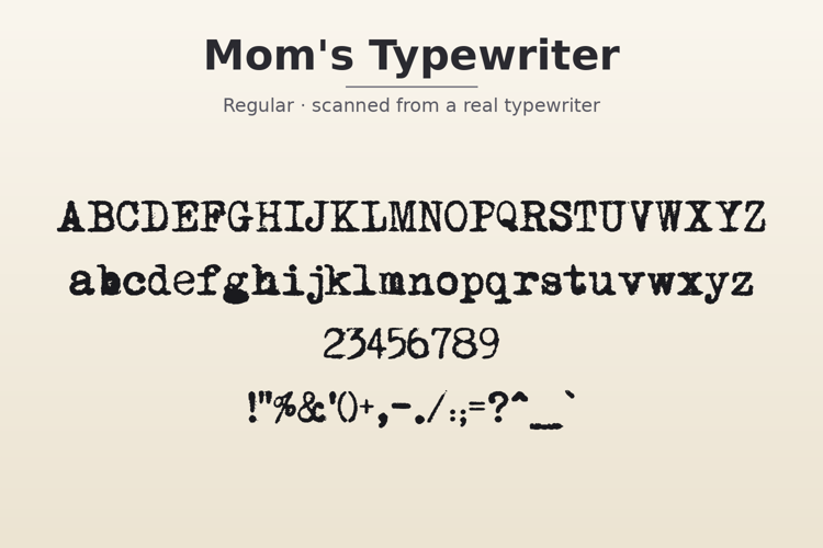
Mom's Typewriter looks like it was typed on a real typewriter and scanned — because it was. The letters are uneven and smudgy, with that soft ink-soaking-into-paper feel, and a few letters even carry little ink blots where the ribbon left too much. It's a great pick for letters, journals, zines, or anything that should feel personal and a little worn with time.
A couple of things to know: there are no 0 or 1 keys in this font (just like the old typewriters it copies — use a capital O and a lowercase l instead), and some punctuation marks are missing.
From the designer: this font is totally free to use, but you may not sell it or change it without permission. You can share it freely as long as you include the original file. Made by Christoph Mueller, 1997.
License Info
Donations
Mom's Typewriter Font Stats
Mom's Typewriter Font is a Typewriter font and was created on . Mom's Typewriter Font has been downloaded 41,258 times, added to 422 collections, and liked 12 times.
Mom's Typewriter Font was recently updated on Oct 1, 2026
Related Styles
Comments

Is it just me, or is the #1 missing? Otherwise, LOVE this font, thank you!

@eqmartin You're right! That's odd, maybe someone will offer to add in the #1
I seem to remember having an old typewriter and being told that the lowercase "L" was also used as the number 1 - could this be the case (pun intended)? However, it might be inconvenient to remember when using the font.
@linderj1 Thanks, I didn't realize that. The L works very well for a 1
Hi,
I need to use zero as well.
Would that then be a capital o?
I have uploaded a version with the 1 and 0 mapped to the appropriate keyboard keys. Minimise your frustration and get it here http://www.fontspace.com/handy/momstypewriteractual
Good specialty effect. Its use is best limited to large size titles and occasional accents. Don't overdo this effect -- it will quickly grow tiresome.