progenisis Font
Designed by
Regular Style

truetype 57 glyphs 65 characters
More info from Cheapskate Fonts
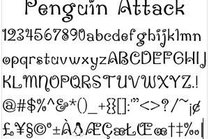
Here is my first attempt at a sci-fi font (this is a precurser to It Wasn't Me). I experiemented with a few things on this one, I made the small letters almost 80% the height of the caps, and I droped the caps below the small letters. Each character also has at least one noticeable gap, giving it a bit of a stencil feel. This one should be pretty good, I haven't looked at it in awhile so let me know if you notice anything strange.
License Info
GPL
progenisis Font Stats
progenisis Font is a Display font and was created on . progenisis Font has been downloaded 1,035 times, added to 12 collections, and liked 0 times.
progenisis Font was recently updated on Aug 7, 2009
Related Styles
Comments
Be the first to comment!