Airborne Font
Designed by
4 font family styles
Regular Style

II Regular Style

II Pilot Regular Style

Pilot Regular Style

More info from Charles Casimiro Design
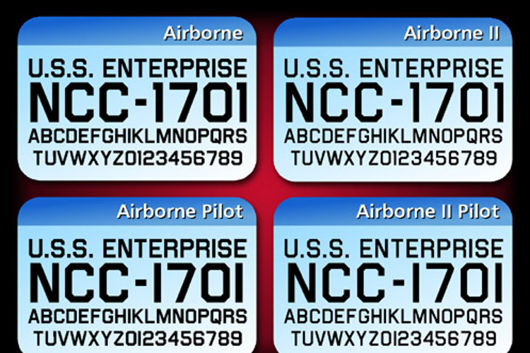
This font was designed to simulate the lettering on the hull of the U.S.S. Enterprise from the 1960's TV show Star Trek. It is more closely related to lettering seen on the hulls of ocean-going ships than to that found on aircraft.
This is the latest version of Airborne, a font I created for hull lettering on TOS-era ships. This version includes several minor corrections, such as shortening the "hooks" on the C and easing back the diagonal stroke on the 7. The four variations currently available are:
- Airborne, the original font based on the decals on the Enterprise
- Airborne Pilot, which has alternate versions of some characters, for use on Pike-era ships
- Airborne II, slightly narrower and lighter in weight than Airborne
- Airborne II Pilot, the Pike-era version of Airborne II
All of the fonts contain full Cyrillic, Greek and Hebrew alphabets, as well as dozens of diacritcs and other special symbols.
License Info
Donations
Airborne Font Stats
Airborne Font is a Navy font and was created on . Airborne Font has been downloaded 97,009 times, added to 521 collections, and liked 28 times.
Airborne Font was recently updated on Jul 25, 2019
Related Styles
Comments
awesome 😄 😛 haha imm bored
How do I Italicize the navy font
This is too cool.