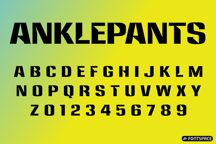
Anklepants Font

Designed by
Regular Style

More info from Ray Larabie
I released Anklepants on December 12, 1997, inspired by the display
typeface used by CBS radio stations owned by Westinghouse. In 1963,
Westinghouse Broadcasting rebranded as “Group W,” and part of that
identity was a distinctive set of call letters and logos that stayed in use
until 1995. I always felt the original font looked like a bit of a hack job
— more like a modified typeface than something purpose-built. My
version wasn’t perfect either, but at least it was drawn from scratch and
felt more like a proper typeface than a retrofit.
Anklepants wasn’t an exact replica. John Sizemore later made a more
faithful digital version of the Westinghouse font. Mine was about
creating a more practical design that carried the spirit of the original
without sticking too closely to it. I released it with a free commercial-use
license.
The name came from an anniversary party where a very drunk guest
wandered around with his trousers around his ankles. The moment
stuck in my mind, and I thought “Anklepants” was a fun, memorable
name that suited the oddball feel of the font. I don’t think the name
ever helped or hurt its adoption, but I still like it.
It wasn’t a big hit, and I don’t remember ever seeing it used in any
notable way. Later, I designed Libel Suit, which also drew from the
Westinghouse look, but the two aren’t related in any deliberate way. In
April 2024, I placed Anklepants in the public domain so it could circulate
freely.
License Info
Anklepants Font Stats
Anklepants Font is a Sci-Fi font and was created on . Anklepants Font has been downloaded 408 times, added to 14 collections, and liked 0 times.
Anklepants Font was recently updated on Aug 12, 2026