Julee Font
Designed by
Regular Style

truetype 242 glyphs 244 characters
More info from Julian Tunni
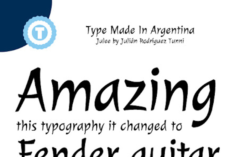
The peculiarity of this typography lies in its curved structures and strokes, which are developed on it by getting thinner and sharper as if they were being typed using a metallic and bevel-edged point.
The visual mark characteristic of Julee is a casual cursive-like type, yet balanced due to the tidy proportions of its signs.
More documentation can be found at www.tipo.net.ar
License Info
SIL Open Font License (OFL)
Julee Font Stats
Julee Font is a Cursive font and was created on . Julee Font has been downloaded 10,240 times, added to 192 collections, and liked 7 times.
Julee Font was recently updated on Sep 9, 2011
Related Styles
Comments

MaryLevycky
2 years agoUsing it for a book about Asia and very happy - after looking through 700 font styles!
Strong, yet slim and easy to read design with a slight Asian aesthetic.