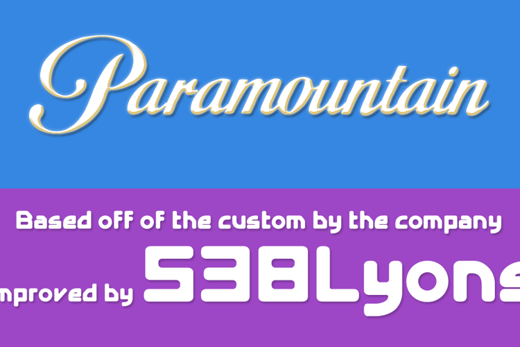
Paramountain Font

Designed by
Regular Style

More info from 538Fonts
Jack Lyric West (629Lyric) has requested me to improve this font, and this is the result, the Paramountain font, the improved version of the other Paramount fonts.
License Info
Commercial licenses
Paramountain Font Stats
Paramountain Font is a Paramount font and was created on . Paramountain Font has been downloaded 18,366 times, added to 159 collections, and liked 77 times.
Paramountain Font was recently updated on Jul 30, 2015
Related Styles
Comments

@629Lyric What's wrong with the kerning?

@DLyonsFont Doesn't match the original logo.
@629Lyric Ah, get it.
@629Lyric Just updated the font already.
@DLyonsFont Eh.. It's better.
@629Lyric I'm so glad it is.

Hey! The capital A is wrong!
@KarloNolasco I tried.

Will Someone Do A 4KidsTV 2005 Logo Font? I Need It As Soon As Possible
It looks great!

It's better than that stupid "Birds of Paradise" font that doesn't have numbers!

@629Lyric Can ya please do a Nickelodeon 1984 Logo font wit' characters including the ™ and ® marks (in Helvetica Neue Medium font) and the @ symbol (in NickBalloon font)? 'Cause I want it as soon as possible!

@GabrielTownsend Yes.

The t looks a little short but the font itself is very unique. 11/10 Font!
Also please add [ ] and ?, more letters from the Latin Alphabet would do, too! : )

One problem. The kerning.