Roboto Font

Designed by
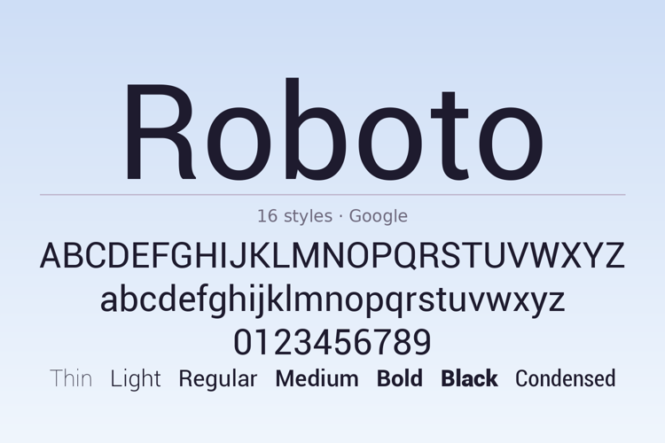
16 font family styles
Regular Style

Light Style

Bold Style

Black Style

Italic Style

Light Italic Style

Bold Italic Style

Black Italic Style

Condensed Style

Bold Condensed Style

Bold Condensed Italic Style

Condensed Italic Style

Medium Style

Medium Italic Style

Thin Style

Thin Italic Style

More info from Google
Roboto is the neo-grotesque sans serif Christian Robertson designed for Google, released in 2011 as the signature typeface of Android 4.0 Ice Cream Sandwich. Its letterforms pair a mechanical grotesque skeleton with open, natural curves, drawn to stay clear and neutral in interface text and comfortable in long reading on screens. This download is the original 2011 release: six weights from Thin to Black, each with its italic, plus a Condensed set in Regular and Bold with italics, 16 styles in all. Every style carries 878 characters covering Latin, Greek and Cyrillic, with a full figure set. Google refined the family in 2014 for Android 5.0; this is the first cut, the one that defined Android's look. Use it for app and web interfaces, body text, documentation, presentations, and clean corporate layouts.
License Info
Roboto Font Stats
Roboto Font is a Roboto font and was created on . Roboto Font has been downloaded 96,340 times, added to 561 collections, and liked 19 times.
Roboto Font was recently updated on Oct 19, 2026
Related Styles
Comments

Roboto Thin is just as good as Helvetica for logotype (actually it works a little better sometimes 😉

Helvetica is overrated (there, I said it), and Roboto is frankly rather ugly. I can’t stand that lowercase g; the descender is small and unbalanced. Wish I could get rid of it on my Android phone.

Can you add new characters from unicode plus ?

Roboto was a four-headed Frankenfont.
You may see the article:
http://typographica.org/on-typography/roboto-typeface-is-a-four-headed-frankenstein/

You have the old version of Roboto font.

Is there any explanation why this font, used widely in electronic devices DOES NOT contain so much as a single Arrow glyph? Who designed this and what can account for this lazy design oversight?

Wow!

This was the system font.


nice! a very good substitute for helvetica!
keep it up, google android!