sweden1's Favorites

by sweden1
2182 41


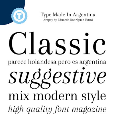
Fashion Victim by Nick's Fonts
100% Free

Like the asymmetry of the caps - both the 'F' and the 'V'. None of our letters are there in caps so would have to see. Would want it to be taller.
222.7k downloads


Think this is pretty dull & clunky actually. Example of how the assym. ''A" & "I" look. But letters seem way too heavy - esp. feet of A and the thickness of the wide A line.
Regular
114.8k downloads
Always Here by Jake Luedecke Motion & Graphic Design
Personal Use Free

Like the tall simple letters & the simple serifs. The serif on top of the A would certainly have to go & we wouldn't have hi cross-bar on A of course; arrow instead. Sort of like the A being taller than other letters. (If we were using the 'S', I'd want it simpler. I prefer AlwaysHereToo to AlwaysHere because former is too pale.
Medium
84534 downloads

FoglihtenNo06 by gluk
100% Free

Think the treatment of 'LI' is interesting - don't know if would work for us. I've played w/ thot of including 'International' with the letters after the 'I' being small. So we'd actually be showing 'ALInternational' instead of the planned 'ALI'. If wanted to do that, the 'LI' arrangement here would lend itself to that.
92027 downloads
