sweden1's Favorites

by sweden1
2223 41
Final Fantasy by Juan Pablo Reyes Altamirano
100% Free

Mostly a little dull because letters are so wide. Like the height, like the treatment of the 'L'. If 'A' vertical lines were asymmetrical instead of just wide, I mite like it. Don't know if design feature of 'F, L, T' could somehow be integrated into design of arrow?
93998 downloads

Cinzel by Natanael Gama
100% Free

Like treatment of letters in Cinzel-Bold except too short. Don't like heaviness of letters in Cinzel-Black; and first one is boring I think.
Regular
53200 downloads
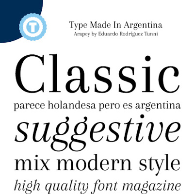
Arapey by Eduardo Tunni
100% Free

Like the assym italics version - but this one has lines that are too narrow. somewhere in width between this & preceding for width of wide lines - and taller letters for a little more drama.
Regular
52950 downloads
Tall Films by GemFonts
Personal Use Free

Boring. Only attracted to height & to italics of second one. Forget it.
Regular
56523 downloads


Accanthis ADF Std by Arkandis Digital Foundry
100% Free

Mite like the almost-tall-enuff 3rd one - in italics. Would like lines in the letters (A & I) to be a little more assym - otherwise a little boring.
Bold
14023 downloads
Illegal Curves by weslo
Personal Use Free

Interesting variation I think. Probably too hard to read. Middle one is most graceful I think, but so-o-o light, it could also disappear. other 2 seem too thick. maybe forget it?
13967 downloads

Snail Mail LDO by Luke Owens
100% Free

Looked at the AIL's & wondered if it would work to do ALI this way except have bottom line start at left & - instead of going across - go up to be a dramatic arrow higher than the letters. You'll know if worth trying or not.
19418 downloads